%201.png)
Role
UX Researcher
Visual Designer
Team
Timeline
Tools
Miro
Google Forms
Illustrator
Zoom
01. Background
Addressing the frustration of outdated and inconvenient transit systems
In Waterloo, public transportation plays a vital role in helping residents navigate and travel through the city, but the city's current system often feels outdated and difficult to use. Currently, there are no reliable digital solutions to help individuals living in Waterloo with public transportation. Many riders face challenges such a struggling with fragmented information across multiple websites and dealing with complicated routes and schedules. These barriers not only create frustration but also make the process of using public transit less efficient and less accessible for students, commuters, and the community as a whole.
Our Solution ₊˚✧
To address these challenges, we ideated and designed HopLink—a digital platform designed to simplify public transportation for all Waterloo residents. This mobile app offers an all-in-one solution, providing users with easy navigation for routes, digital ticketing, rewards and incentives, and personalized features like saved routes and user profiles. HopLink helps users to manage their transportation needs effortlessly, making commuting more convenient and enjoyable for everyone!
02. Problem Discovery
Exploring issues with accessing public transportation
Public transportation plays a key role for many commuters, but the city of Waterloo's outdated systems often create unnecessary frustration for riders. With confusing routes, outdated schedules, and the need to check multiple platforms for updates, the experience can be time-consuming and inefficient.
How might we design a compelling system that encourages regular public transportation usage by addressing the diverse needs and preferences of commuters?
This highlights the need for a more streamlined, user-friendly solution to improve convenience and accessibility for everyone using transit in the city, which is exactly what we aimed to address with our design.
03. User Research and insights
Digging deeper into rider's motivations and pain points
We created and shared an online survey to hear directly from transit riders about their experiences with public transportation in the Waterloo region. By gathering feedback on both the positives and the negatives, we wanted to better understand what’s working and where there’s room for improvement.

We shared the survey across a range of social media platforms, and it received over 35 replies! The majority of participants were young adults, aged 18 to 24, giving us valuable insights from a key group of transit riders who are often on the go.
✦ 80%
of respondents
uses a contactless card as their primary payment method, emphasizing a preference for cashless transactions.
✦ 65% of
respondents
said that lack of convenience and unreliable schedules are their main reasons for avoiding public transit.
✦ 89% of
respondents
indicated a positive response to being incentivized to boost their ridership, with the use of a rewards system
Following that, we had one-on-one interviews with two University students who rely on public transportation on a daily basis. Our goal was to connect on a personal level, delving into the unique challenges they faced and exploring the daily struggles encountered when trying to access their transportation services.

Interviewee 1
"Personally, it's too inconvenient for me to carry a physical card around. I use a mobile app because having a physical card is not as reliable for me, I’m always worried about losing it."
Interviewee 2
“Sometimes I'd be coming home from work and out of nowhere [the local transit service] would have changed my bus stop to like a bus stop down the road because my bus was taking a different turn, but the only way I would know that in the first place is if they put a paper sign on the bus stop!”

Key Insights from user survey and interviews
✦ Mobile App Convenience
Prioritize mobile app features that replace or enhance physical card functions. We should aim to ensure the mobile app is reliable, easy to use, and provides a seamless experience to encourage adoption
✦ Up to Date Information
Enhance the discoverability of information about route changes or disruptions, ensuring users are informed proactively. We can consider integrating push notifications or alerts within a transportation app to keep users informed about any changes, avoiding surprises and disruptions.
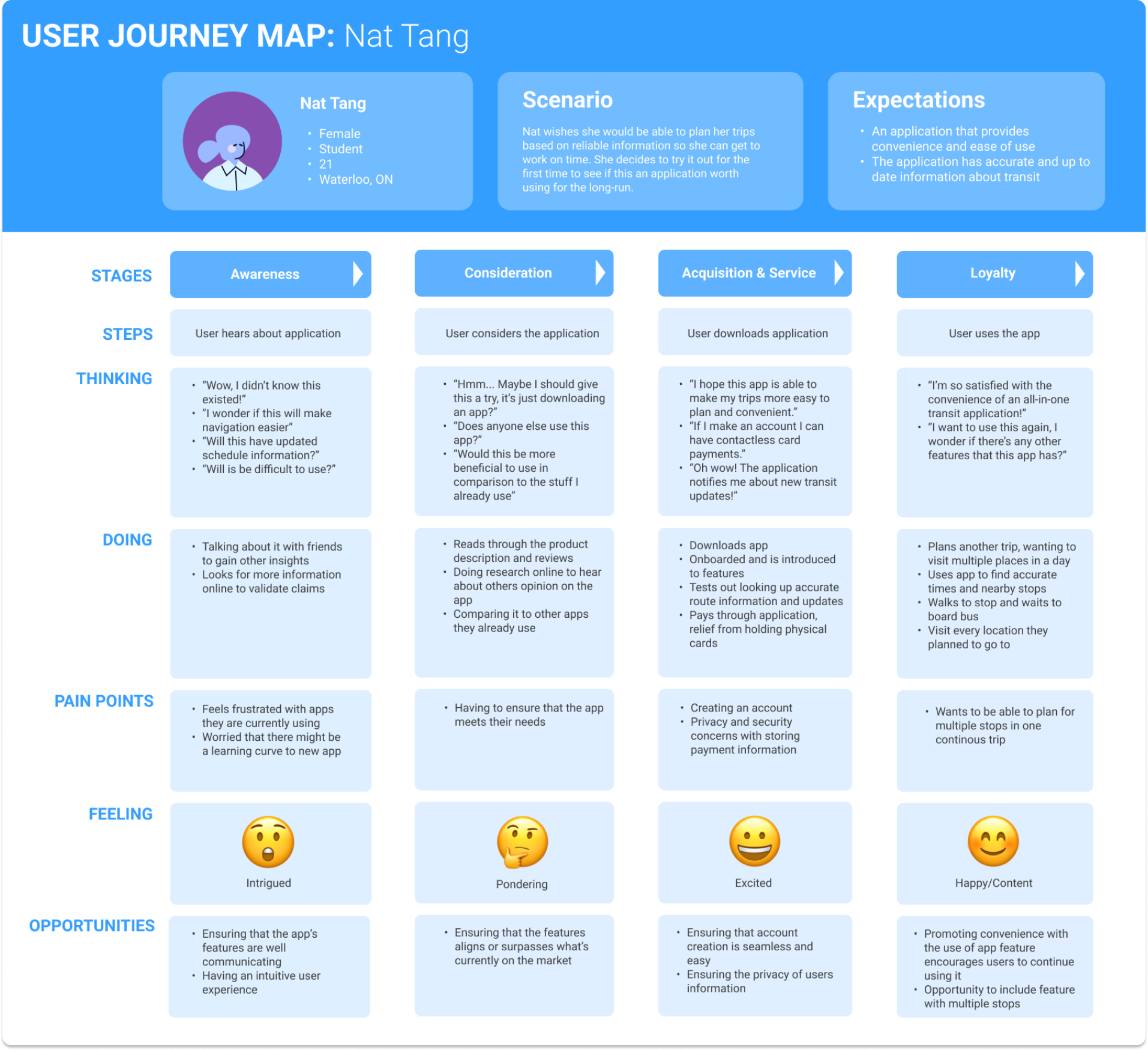
Defining the User's Journey
Using the insights gathered from our user interviews and prior research, we mapped out one of their potential journeys, outlining their interactions, challenges, and decision-making processes at each stage.
Outlining the User's Goals and Painpoints
Afterwards, we crafted a persona for the specific challenges the users we talked to encountered. This process enabled us to better understand the obstacles and objectives unique to each personality.
.png)
-1.png)

Key Research Takeaways
After completing our user research, we consolidated a curated list of key features to target in the final design of our app that we believed would address certain user pain points.
🗺️ Navigation
Include a feature that enables users to look up routes and ways to plan trips through public transportation using reliable and up-to-date information.
🔔 Provide Information
Make sure users are able to receive live and relevant information pertaining their routes and anything regarding their local public transportation.
💳 Mobile Fare Payment
Ensure that there's a way for users to pay for their fare through their mobile device and a way to organize other methods of fare payment
04. Ideation
Building out the Site
Following that, we put together an information architecture map to visually plan and organize the flow of our app. With multiple features in mind, this approach helped us create a clear structure that supports a variety of user interactions and keeps everything running smoothly!

Low Fidelity Mockups
After planning out and outlining the required features and flows, we created and prototyped the low-fidelity screens.

05. User Testing and Insights
Gathering User Feedback
To get a closer look at how people interacted with our prototype, we invited 5 users for a think-out-loud session, followed by short interviews on our mid-fidelity prototype. We assigned them 4 tasks to complete, recording their thoughts and processes along the way. Afterwards, we gathered direct quotations and created an affinity map. We categorized all their insights into themes, giving us a better grasp of what topics stood during our study.
Consolidating User Testing Insights
To consolidate the user feedback we organized it into 3 sections: what users enjoyed, what users had difficulty with and future improvements we should aim to implement.
Key User Testing Takeaways
⚙️ Confusing User flow
Users expressed confusion about the context of certain features and actions they were expected to take. This feedback suggests where clearer instructions and more intuitive design could improve the experience.
🔎 UI Visibility
Users struggled with noticing key UI components, such as the 'Buy Ticket' option. This feedback suggests making these elements more prominent to improve visibility and ease of use.
✨ Feature Clarity
Users struggled with navigation, often unsure of the next steps. This feedback points to a need for a more intuitive user flow and clearer design elements that guide the user more effectively.
06. Refining the Design Based on Feedback
Revisiting and reiterating the design
After consolidating the user feedback, we immediately applied the insights to refine our design. Here are some key changes we made based on the feedback:

Before
Users noted that it was very unclear as to how to organize a saved location into a collection due to lack of clear iconography and instructions.

After
To address this, we labelled other buttons that appear on the screen to avoid confusion and included an "edit" button that enables users to select the collection they want the saved location to move to.

Before
Users noted that it was very inconvenient to enter/scan a method of payment every time they wished to purchase a ticket or reload a pass.

After
To address this, we implemented a section in which they can add/save a preferred method of payment to expedite this process.
Establishing our branding and style guide
We then put together a style guide and branding to make sure our visual designs stayed consistent across the platform. This helped us create a unified look and feel. Our goal was to make the platform feel trustworthy, so users could rely on it, while also keeping the design friendly and approachable to ensure a welcoming experience.

07. Final Designs
Introducing Hoplink

Hop in to your Journey!
Explore the app's features through a simple guided introduction, where users can easily log in or create a new account for a more personalized and engaging experience.

Explore your City with Ease!
Effortlessly navigate your daily commute to work, school, or any destination using the map and navigation feature of HopLink for a straightforward and stress-free trip.

Receive real-time updates.
Stay in the loop with real-time notifications, keeping you updated on route changes and important public transportation details in your area. Enjoy the convenience of instant, up-to-date info for a great travel experience!

Effectively manage your fare payments and passes.
Easily manage your payment methods and fares with our user-friendly system. Simplify the process, giving you the flexibility to choose from various payment options for a quick and personalized experience!

Be rewarded for your ridership!
Get exclusive deals as a thank-you for your regular ridership. Enjoy special rewards and perks that make your frequent journeys even more rewarding and fun.

Save and organize your favourite locations
Store and organize your favourite destinations and routes in one easy-to-use place. Simplify your travel planning with quick access to your go-to spots!
.gif)
Personalize your account
Make your experience truly yours by personalizing your profile. Customize your settings, preferences, and details to reflect your style and needs!
06. Conclusion
Reflections
This experience taught me a great deal about collaborating with users to refine my designs to enhance overall usability. My team was really pleased with the final outcome, as this project allowed us to learn the entire process of designing an app, from conception to execution. Some key takeaways I gained were:
🤝 Working with the User
Collaborating with users throughout the testing phase has been both very insightful and rewarding. A major takeaway is the importance of clear communication in ensuring a straightforward testing process. By setting clear expectations, explaining the purpose behind the tests, and guiding users (when needed) through our prototypes, we were able to create a more collaborative environment and receive higher-quality feedback!
🌎 Improving What Works
While designing certain features for this application, I’ve learned that sometimes it’s better not to overcomplicate things just to be unique. Recognizing what works well and, more importantly, what users enjoy is crucial. It’s not always about creating something completely new; often, it’s about improving what’s already great.
Next Steps...
🌻 Expanding User Testing
Due to limited resources, we were only able to recruit university students for user testing. If I were to revisit this project, one of the next steps I would like to take is to expand the sample size to include a more diverse group of participants. This would have helped ensure the design worked for a broader range of users, taking into account different needs and preferences and allowing us to gather even more comprehensive feedback to improve the overall user experience.
Thanks for stopping by *・。゚
Feel free to get in touch!


